Snapshot of health of business dashboard
This dashboard gives you an overview of the health of your business. In one view,
you can look at all the KPIs that matter along with their trend over time and
comparison across locations.
View definitions of KPIs and see how each KPI maps to a core report
To view the snapshot of your business metrics dashboard
At the organization level, navigate to Data & insights > Analytics.
The Analytics page appears.
On the Analytics Express tab, click Snapshot of your business metrics.
The dashboard opens in a new tab or window.
The dashboard has two tabs:
Snapshot of Business Metrics
Top-line and Traffic Trends
By default, the dashboard shows you the data for all the centers to which you have
permissions.
To filter your dashboard data
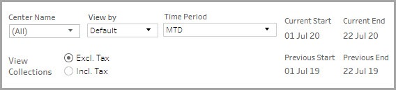
The filters help you focus on the data that is important to you.
Center Name: Lets you filter the data to see information about all, one, or a set of centers.
View By: Lets you set the durations by which you want to compare the data. The available options are - Day, Week, Month, Quarter, and Year.
Time Period: Lets you set the durations for which you want to compare the data.
The available options are - WTD (week-to-date), MTD (month-to-date), Previous
Month, QTD (quarter-to-date), YTD (year-to-date), and Custom (lets you set
the start date and end date for the dashboard).
View Collections: Lets you indicate whether the amounts on the dashboard must include or exclude tax.
To learn how to save filters and customize your default view, refer to https://help.tableau.com/current/pro/desktop/en-us/customview.htm
Anatomy of the dashboard
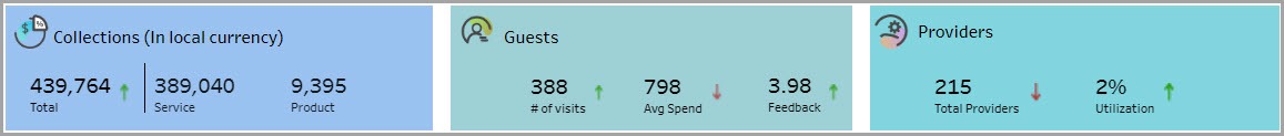
The first section of the dashboard provides you insights into your centers’
performance on collections, guests, providers.
The Collections box shows you the total collections and also the break-up for your top 2 items. A green or red arrow indicates whether the value is up or down based on the last period.
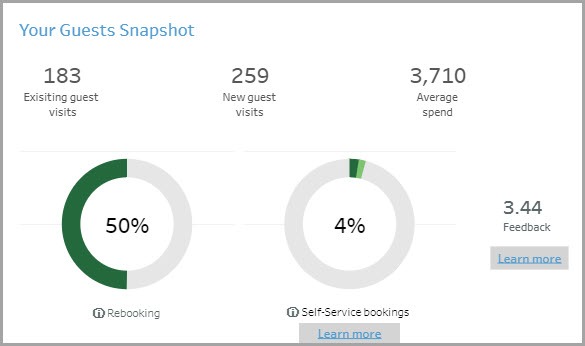
The Guests box shows you three metrics - how many guest visits you had, how much they spent on average, and the average rating they gave your center.
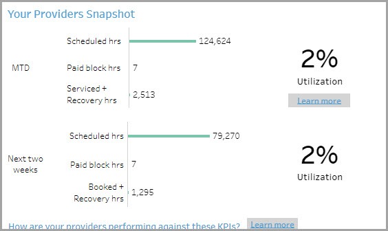
The Providers box shows you the total number of providers you have and their utilization percentage.
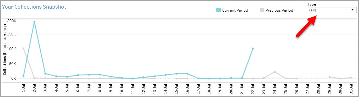
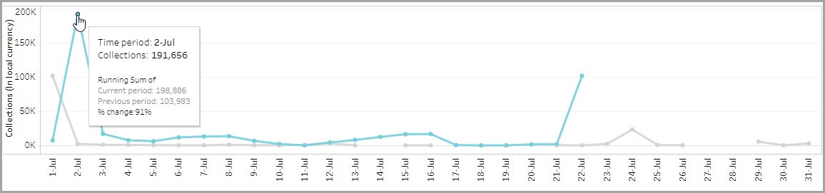
The Your Collections Snapshot section shows you how your collections are
trending. Depending on your selection in the Time Period filter, you can compare the current period’s data to the previous period’s. For example, if you have set the
Time Period to MTD, it compares the current month’s data to the same month in the previous year.
The Type filter lets you filter the graph to see collections by gift cards, memberships, packages, etc.
The Your Guests Snapshot section lets you see how your center is performing with respect to visits by existing guests and new ones. The numbers here reflect the number of guest visits. For example, if a guest has come on two different occasions, it will be counted as two visits. Click the Learn More links to see the Guest deep-dive dashboards.
The Your Providers Snapshot section shows how you are utilizing your providers.
Click the Learn More links to see the Providers deep-dive dashboards.
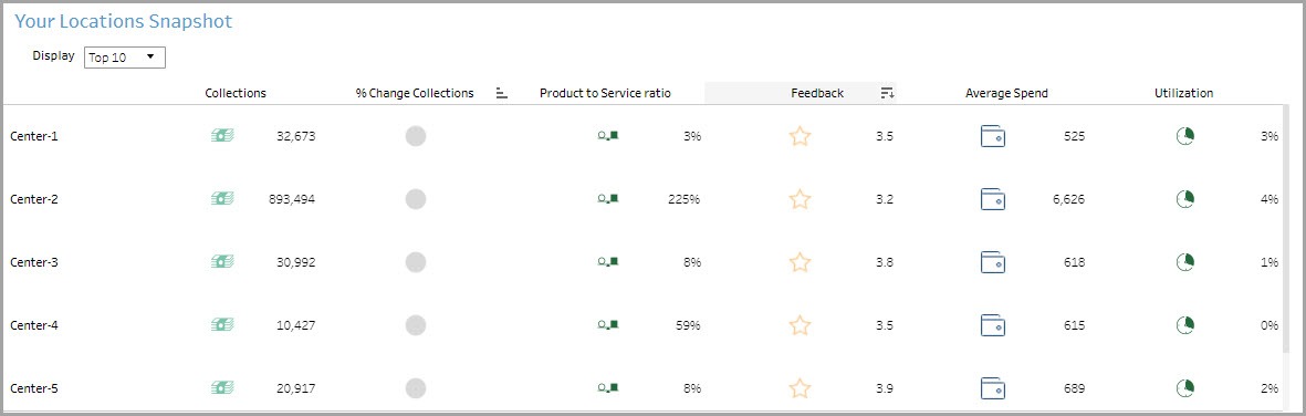
The Your Locations Snapshot section lets you compare the performance of
centers against each other.

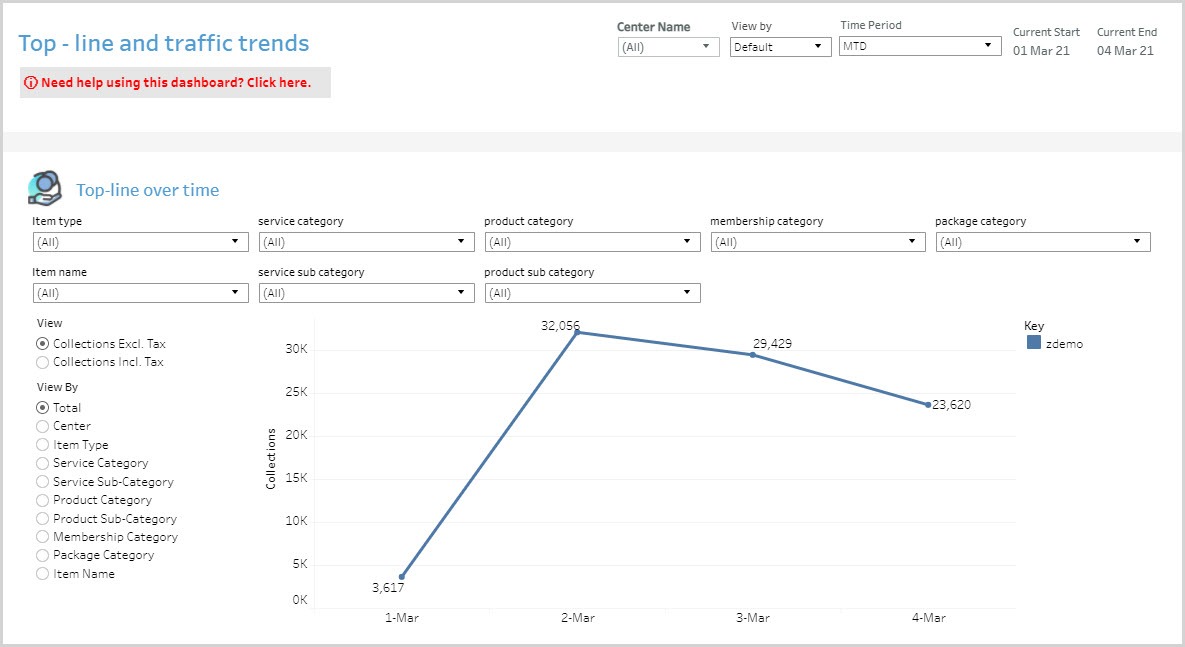
The Top-line Snapshot section shows you the collections at the various centers.
You can see this amount including and excluding taxes.
You can further slice the data on this graph by center, item type, service category and sub-category, product category and sub-category, membership category, package category, and item name.
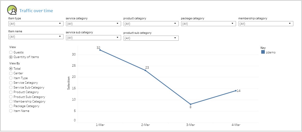
The Traffic Snapshot section lets you see the number of guests that visited the centers, and the quantity of items sold.
You can further slice the data on this graph by center, item type, service category and sub-category, product category and sub-category, membership category, package category, and item name.
Using the dashboard
Hover over data points to see more information.
KPIs in tables can be sorted by any desired metric. For example, hover on
Feedback in the table and you will see an icon to sort the data from High to Low or vice versa. This lets you order locations on the basis of a selected metric.