Guest Satisfaction dashboard
This dashboard gives you a comprehensive overview of the feedback submitted by your guests. The dashboard has two tabs:
Feedback Summary: This tab shows you information such as the submission percentage, average rating, and feedback trends over time.
Provider and guest details: This tab gives you more details about the feedback based on providers and types of guests.
View definitions of KPIs and see how each KPI maps to a core report
To view the Guest Satisfaction dashboard
At the organization level, navigate to Data & insights > Analytics.
On the Analytics Express tab, click Guest Satisfaction.
By default, the dashboard shows you the data for all the centers to which you have permissions.
To filter your dashboard data
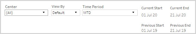
The filters help you focus on the data that is important to you.
Center Name: Lets you filter the data to see information about all, one, or a set of centers.
View By: Lets you set the durations by which you want to compare the data. The available options are - Day, Week, Month,
Quarter, and Year.
Time Period: Lets you set the durations for which you want to compare the data. The available options are - WTD (week-to-date), MTD (month-to-date), Previous Month, QTD (quarter-to-date), YTD (year-to-date), and Custom (lets you set the start date and end date for the dashboard).
To learn how to save filters and customize your default view, refer to https://help.tableau.com/current/pro/desktop/en-us/customview.htm
Anatomy of the dashboard
The feedback summary tab
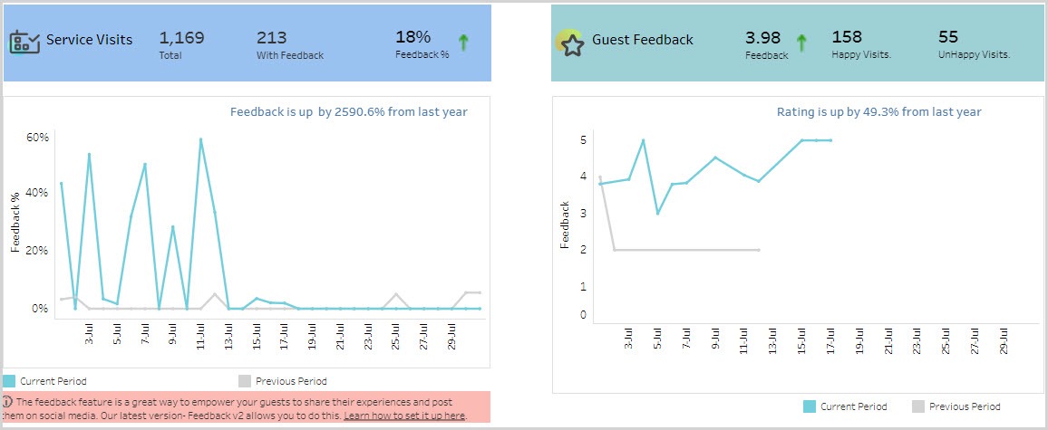
The first section of the dashboard provides you insights into how many guests have provided feedback and the average feedback rating.
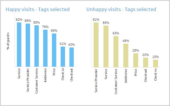
The Tags Selected section shows you what tags your happy and unhappy guests have selected. This helps you decide on which aspects you should concentrate on to retain satisfied guests and what aspects to improve on to convert unhappy guests.
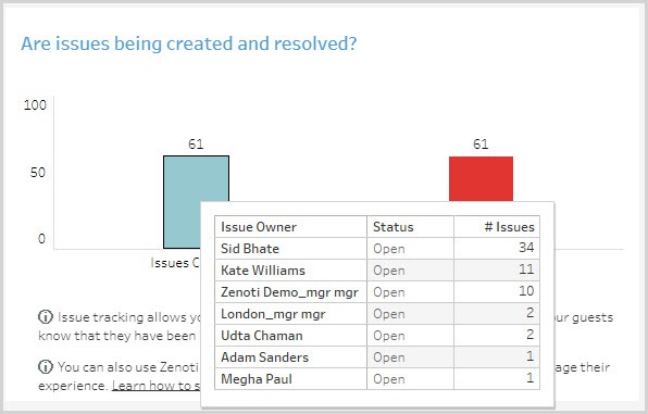
The Are issues being created and resolved section lets you know if issues identified in the negative feedback is being addressed. You can also see which providers have open issues and follow up with them.
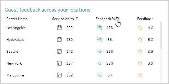
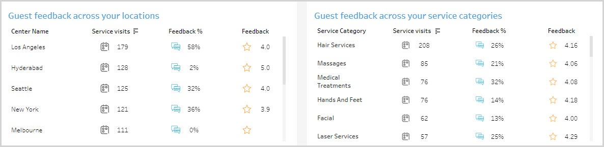
The Guest feedback across your locations section shows you how each center is performing in terms of getting feedback and the ratings they are receiving.
The Guest feedback across your service categories section shows you the average guest rating across service categories.
The provider and guest details tab
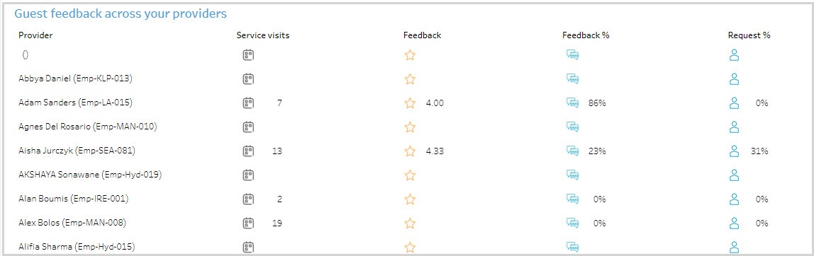
The Guest feedback across your providers table lets you compare feedback ratings and Request % across employees.
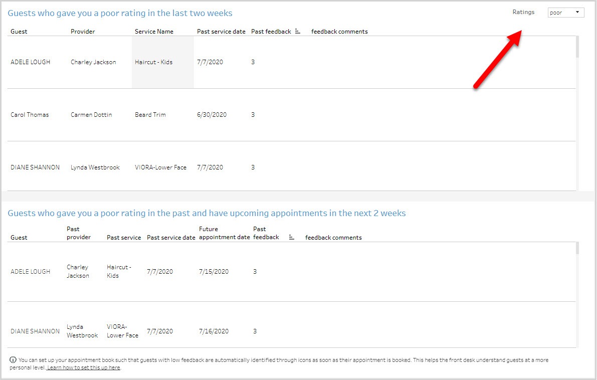
The Guests who gave you a rating in the last two weeks section shows you the guests who rated you in the last two weeks. Use the Ratings drop-down list to switch between viewing good ratings and poor ratings.
The Guests who gave you a rating in the past and have upcoming appointments in the next 2 weeks section shows you the guests who rated you in the past and have
upcoming appointments. This helps you give them a better experience by ensuring
that you give them more of what they liked and avoid things they did not like. Use the
Ratings drop-down list to switch between viewing good ratings and poor ratings.
Using the dashboard
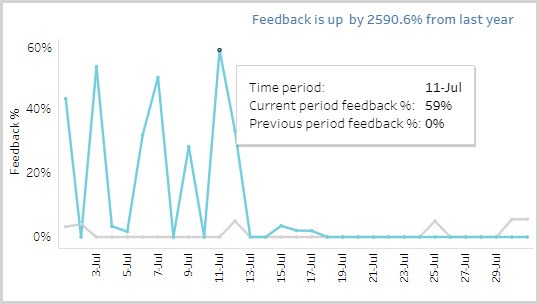
Hover over data points to see more information.
KPIs in tables can be sorted by any desired metric. For example, hover on Feedback
in the table and you will see an icon to sort the data from High to Low or vice versa.
This lets you order locations on the basis of a selected metric.