Retail Performance dashboard
This dashboard gives you a comprehensive understanding of your retail sales across
different KPIs.
View definitions of KPIs and see how each KPI maps to a core report
To view the Retail Performance dashboard
1. At the organization level, navigate to Data & insights > Analytics.
The Analytics page appears.
2. On the Analytics Express tab, click Retail Performance.
The dashboard appears on a new tab or window.
By default, the dashboard shows you the data for all the centers to which you have
permissions.
To filter your dashboard data
The filters help you focus on the data that is important to you.
Center: Lets you filter the data to see information about all, one, or a set of
centers.
View By: Lets you set the durations by which you want to compare the data. The
available options are - Day, Week, Month, Quarter, and Year.
Time Period: Lets you set the durations for which you want to compare the data. The
available options are - WTD (week-to-date), MTD (month-to-date), Previous Month,
QTD (quarter-to-date), YTD (year-to-date), and Custom (lets you set the start date and
end date for the dashboard).
To learn how to save filters and customize your default view, refer to
https://help.tableau.com/current/pro/desktop/en-us/customview.htm
Anatomy of the dashboard
The KPIs on the dashboard let you understand your retail performance on a variety of
parameters.
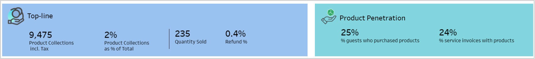
Topline: Shows your top-line in terms of value and quantity. It also shows you product
collections and refunds as a percentage of total collections and quantity sold.
Product Penetration: Shows you the percentage of guests also purchased retail
products and the percentage of service invoices that had at least one product on it.
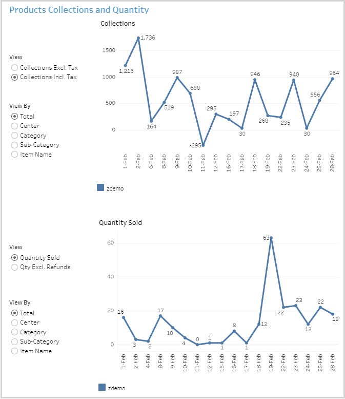
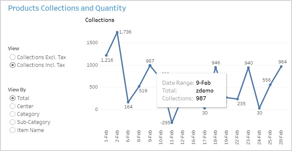
Product Collections and Quantity: Shows two trend graphs. One shows the
collections and the other the quantity sold.
On the Collections graph, you can see the values inclusive or exclusive of taxes. On
the Quantity Sold graph, you can see the values inclusive or exclusive of refunds.
You can further slice the data on this graph by center, category and sub-category, and
item name.
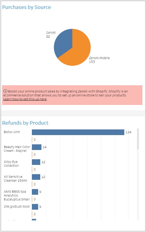
Purchases by Source: Shows the contributions of each of your sales points – store,
online, mobile – to your sold quantity.
Refunds by Product: Shows the number of refunds against the number of the
product sold.
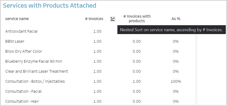
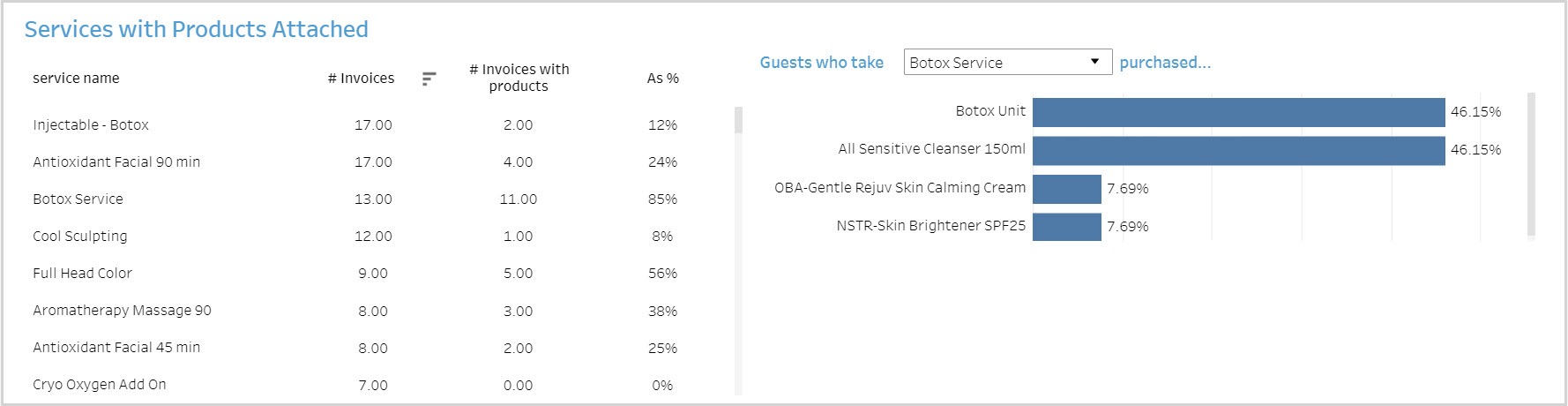
Services with Products Attached: Shows, for each service rendered, how many
invoices also had a product sold. You can also see what products guests who took a
particular service usually bought.
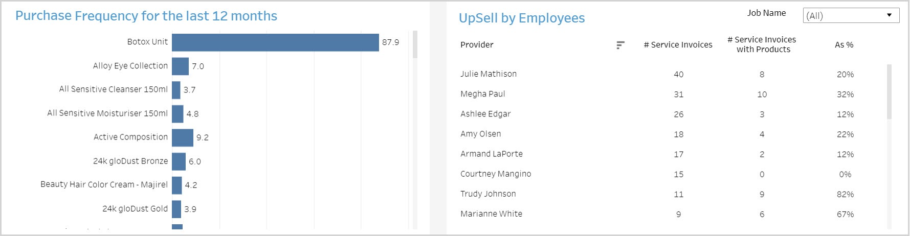
Purchase Frequency for the Last 12 Months: Shows the quantity sold of each
product per guest in the last 12 months. This metric gives you an indication of how
often guests are buying a particular product in a 12-month period.
Upsell by Employees: Shows how many times an employee sold a product on the
same invoice as a service.
Using the dashboard
Hover over data points to see more information.
KPIs in tables can be sorted by any desired metric. For example, hover on #Invoices
in the table and you will see an icon to sort the data from High to Low or vice versa.
This lets you order the information based on a selected metric.