Provider Utilization dashboard
This dashboard gives you an overview of your providers' utilization. On the
dashboard, you can track the breakdown of current utilization and utilization over
time. You can also compare utilization across providers and across locations.
View definitions of KPIs and see how each KPI maps to a core report
To view the Provider Utilization dashboard
At the organization level, navigate to Data & insights > Analytics.
The Analytics page appears.
On the Analytics Express tab, click Provider Utilization.
The dashboard opens in a new tab or window.
By default, the dashboard shows you the data for all the centers to which you have
permissions.
To filter your dashboard data
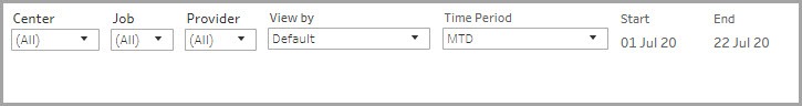
The filters help you focus on the data that is important to you.
Center: Lets you filter the data to see information about all, one, or a set of centers.
Job: Lets you filter the data by job. The drop-down list shows all the jobs that you
have configured for the centers.
Provider: Lets you filter the data by provider. The drop-down list shows all the
employees in your organization.
View By: Lets you set the durations by which you want to compare the data. The
available options are - Day, Week, Month, Quarter, and Year.
Time Period: Lets you set the durations for which you want to compare the data. The
available options are - WTD (week-to-date), MTD (month-to-date), Previous Month,
QTD (quarter-to-date), YTD (year-to-date), and Custom (lets you set the start date and
end date for the dashboard).
To learn how to save filters and customize your default view, refer to
https://help.tableau.com/current/pro/desktop/en-us/customview.htm
Anatomy of the dashboard
The first section of the dashboard provides you a high-level overview of the utilization
of the providers in your organization.

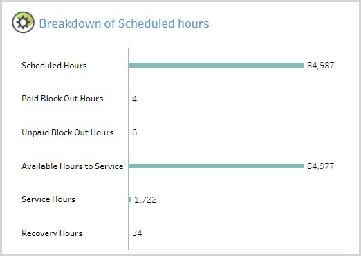
The Breakdown of Scheduled Hours graph shows you the breakdown by Scheduled
Hours, Paid Block Out Hours, Unpaid Block Out Hours, Available Hours to Service,
Service Hours, and Recovery Hours.
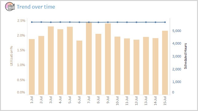
The Trend over Time graph shows the trend of utilization over the selected duration.
The pink bar represents Utilization % and the blue line represents Scheduled hours.
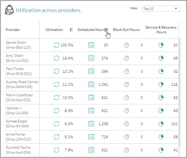
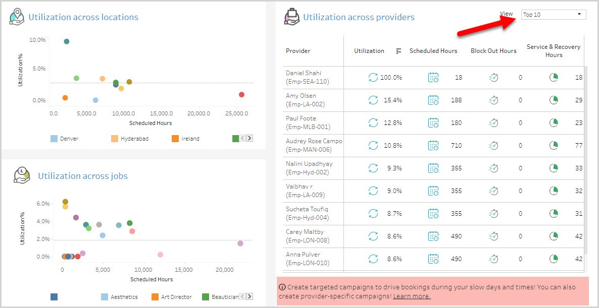
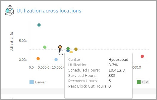
The Utilization across locations, Utilization across providers, and Utilization across
jobs graphs help you identify what areas you need to concentrate on to improve
utilization of providers’ time. From the View drop-down list, you can choose to view
all the providers or only the top 10.
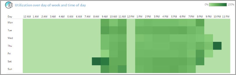
The Utilization over day of week and time of day graph shows you a heatmap of
your busiest and least busy times in a day. Dark green blocks indicate high utilization
and light green blocks indicate low utilization.
Using the dashboard
Hover over data points to see more information.
KPIs in tables can be sorted by any desired metric. For example, hover on Scheduled
Hours in the table and you will see an icon to sort the data from High to Low or vice
versa. This lets you order locations on the basis of a selected metric.