Self service dashboard
This dashboard gives you a comprehensive overview of your self-service bookings.
The dashboard has two tabs:
Adoption Summary: This tab shows you items that are booked through self-service channels. It also looks at self-service bookings over time, by location, and compares demographics of guests who use self-service and those who don't.
Impact on the business: This tab looks at the benefit of self-service channels to the business.
View definitions of KPIs and see how each KPI maps to a core report
To view the self service dashboard
At the organization level, navigate to Data & insights > Analytics.
The Analytics page appears.
On the Analytics Express tab, click Self Service Bookings.
The dashboard opens in a new tab or window.
By default, the dashboard shows you the data for all the centers to which you have
permissions.
To filter your Adoption Summary dashboard data
The filters at the top of the Adoption Summary tab help you focus on the data that is
important to you.
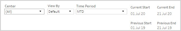
Center Name: Lets you filter the data to see information about all, one, or a set of centers.
View By: Let you set the duration by which you want to compare the data. The available options are - Day, Week, Month, Quarter, and Year.
Time Period: Let you set the duration for which you want to compare the data. The available options are - WTD (week-to-date), MTD (month-to-date), Previous Month, QTD (quarter-to-date), YTD (year-to-date), and Custom (lets you set the start date and end date for the dashboard).
To see the impact on the business or selected centers
You can use the filters at the top of the Impact on business tab to see the impact on a specific center or compare across multiple centers.
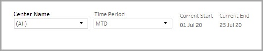
Select the centers for which you want to see the data.
Select the time period for which you want to see the data
Learn how to save filters and customize your default view here: https://help.tableau.com/current/pro/desktop/en-us/customview.htm
Anatomy of the dashboard
The Adoption Summary tab
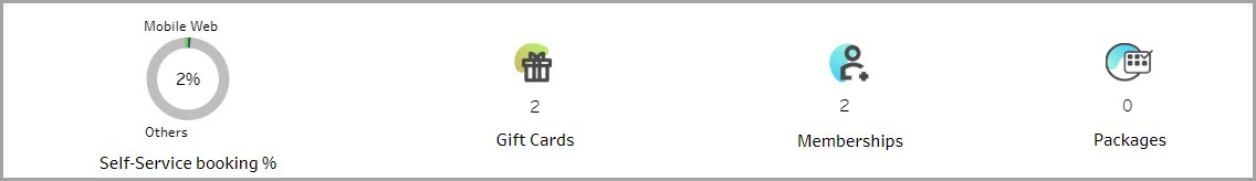
The first section gives you a high-level view of the self-service channel adoption
across appointments, gift cards, memberships, and packages.
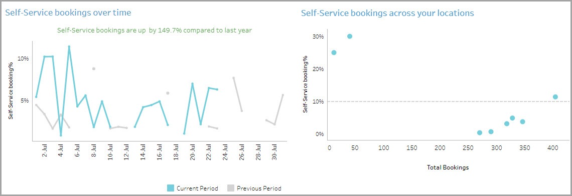
The Self-Service bookings over time graph shows you how many guests are using the self-service feature across a period of time.
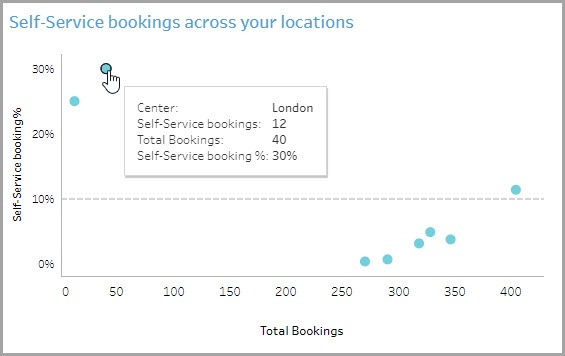
The Self-Service bookings across your locations graph shows you how many self-service bookings are happening at each of the centers.
To see more details, place your mouse cursor over the data points in the graph.
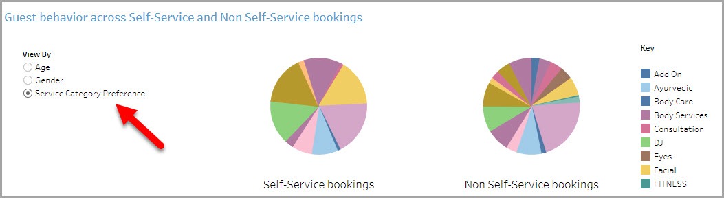
The Guest behavior across Self-Service and Non Self-Service bookings graph lets
you see the performance of self-service bookings across age, gender, and service categories.
To see more details, place your mouse cursor over the data points in the graph.
The impact on the business tab
The Bookings around the clock graph lets you see which types of bookings are popular at different times of the day. For instance, you might find that online bookings are usually made late at night.
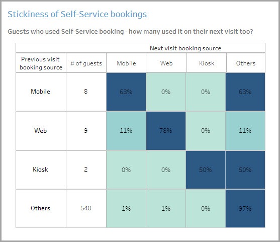
The Stickiness of Self-Service bookings chart shows you how often people who make one self-service booking use it for the next booking.
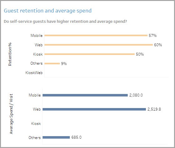
The Guest retention and average spend graph lets you see whether guests using self-service options come back for more and how much they spend per visit.
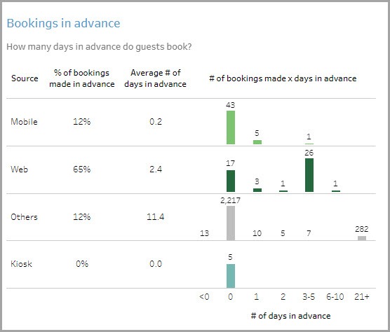
The Bookings in advance graph shows you how many advance bookings your guests made and how early they booked in advance of their visit.
Using the dashboard
Hover over data points to see more information.