Performance review of providers dashboard
This dashboard gives you a comprehensive understanding of your providers’ performance across KPIs. The dashboard has two tabs:
The Provider Summary tab: Lets you compare providers on a variety of KPIs.
The Provider 1 on 1 tab: Lets you compare a provider’s performance against the performance of the other providers.
View definitions of KPIs and see how each KPI maps to a core report
To view the provider performance dashboard
At the organization level, navigate to Data & insights > Analytics.
On the Analytics Express tab, click Provider Performance.
By default, the dashboard shows you the data for all the centers to which you have permissions.
To filter your provider summary dashboard data
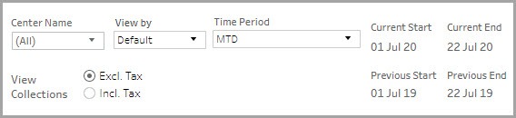
The filters at the top of the Provider Summary tab help you focus on the data that is important to you.
Center Name: Lets you filter the data to see information about all, one, or a set of centers.
View By: Lets you set the durations by which you want to compare the data. The available options are - Day, Week, Month, Quarter, and Year.
Time Period: Lets you set the durations for which you want to compare the data. The available options are - WTD (week-to-date), MTD (month-to-date), Previous Month, QTD (quarter-to-date), YTD (year-to-date), and Custom (lets you set the start date and end date for the dashboard).
View Collections: Lets you indicate whether the amounts on the dashboard must include or exclude tax.
To compare a provider’s performance with others
The filters at the top of the Provider 1 on 1 tab help you select the provider you want to compare and other parameters.
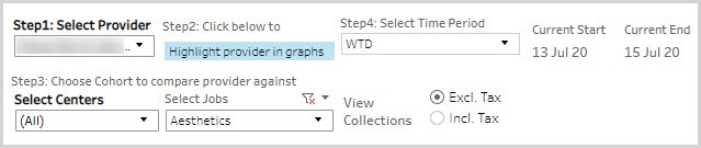
Select the provider you want to compare against the other providers.
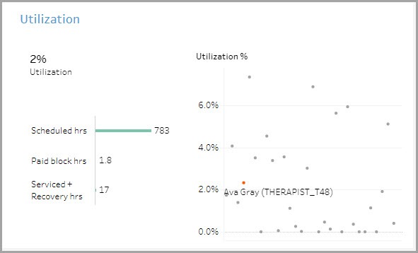
Select this if you want the selected provider’s data highlighted in the graphs. If you select this option, the selected provider’s data points will be displayed in orange in the graphs.
Select whether you want to compare the selected provider against providers in all centers or with those in specific centers. Select the jobs with which you want to compare the selected provider’s performance. Only the providers selected will be visible in the graphs.
Indicate whether you want the values to be displayed to include or exclude the tax amount.
To learn how to save filters and customize your default view, refer to https://help.tableau.com/current/pro/desktop/en-us/customview.htm
Anatomy of the dashboard
The Provider Summary tab
The first section gives you a high-level overview of the provider’s performance across major KPIs.
The Collections across your jobs graph show the Collections broken down by job roles and time. Use the Job drop-down list to select a subset of the job roles you want to look at.
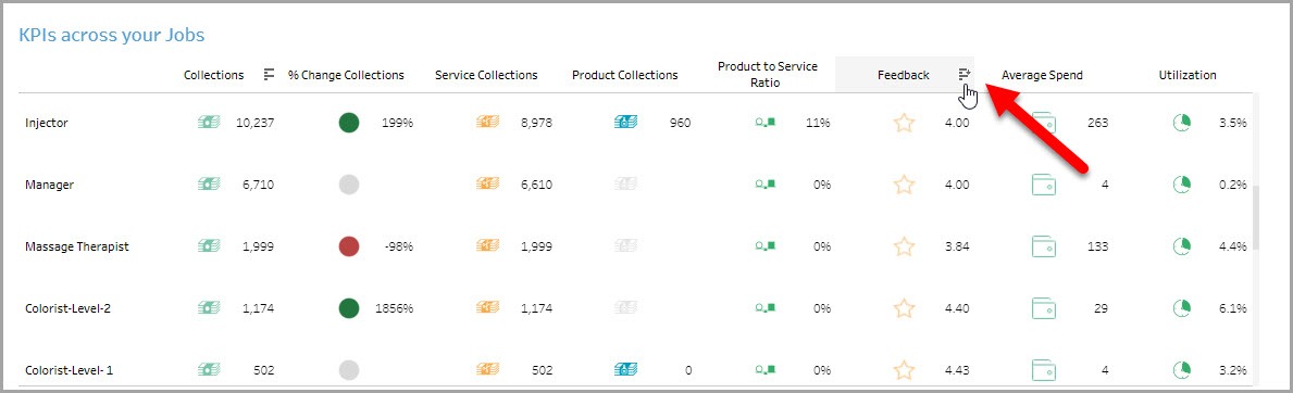
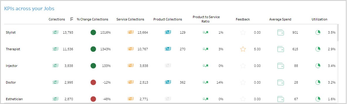
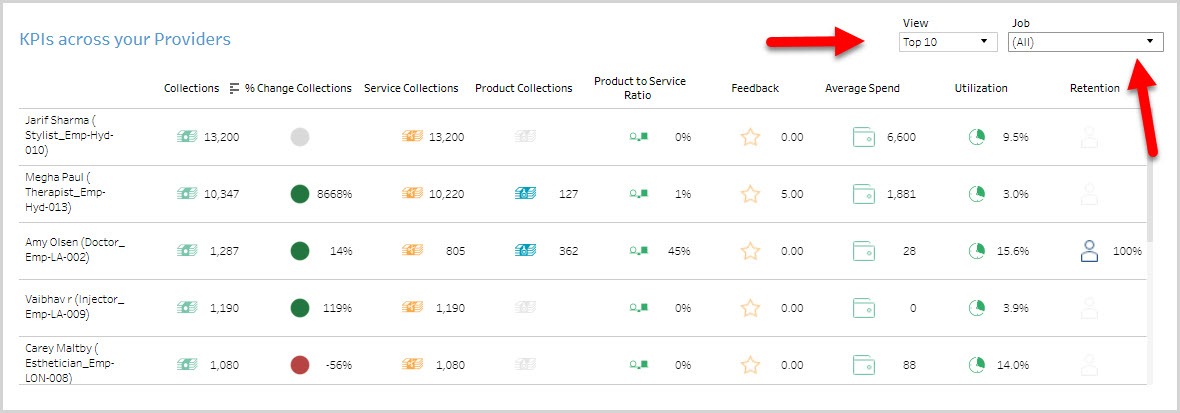
The KPIs across your jobs table lets you compare the select job roles across multiple KPIs such as collections, feedback, average spend, utilization, etc.
The KPIs across your providers table lets you compare providers across multiple KPIs such as collections, feedback, average spend, utilization, etc.
The Provider 1 on 1 tab
The first section of the dashboard provides a high-level overview of the selected provider’s performance across key KPIs.

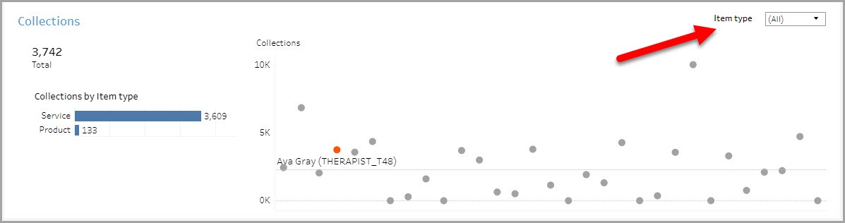
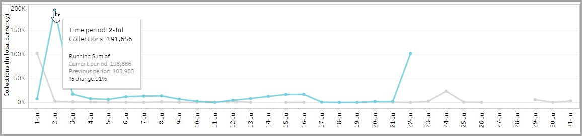
The Collections graph gives you details on the collections brought in by the selected provider.
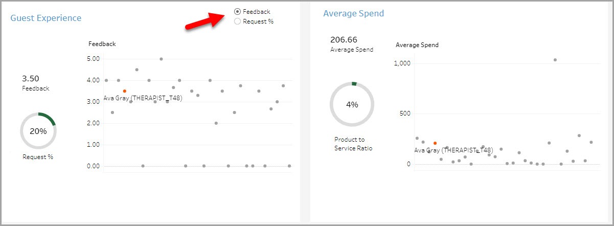
The Guest Experience graph shows the average feedback rating the selected provider received from guests and the request %.
The Average Spend graph shows the average amount the selected provider’s guests spent on every visit.
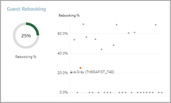
The Guest Rebooking graph shows the rebooking of guests serviced by the selected provider.
The Utilization graph shows the utilization of the selected provider.
Using the dashboard
Hover over data points to see more information.
KPIs in tables can be sorted by any desired metric. For example, hover on Feedback in the table and you will see an icon to sort the data from High to Low or vice versa. This lets you order locations on the basis of a selected metric.